Boulard.
We designed the visual identity for a Basque cheesecake maison that brings European craft and quiet luxury to the Cancún food scene.
A Basque cheesecake maison in Cancún, built the way European houses are built: slowly, with craft, without noise.
Boulard is end-to-end branding: naming, visual identity, packaging, art direction and launch campaign, all designed as a single piece. Every decision, from the cut in the “O” to the red ribbon on the box, answers to one idea: luxury isn't announced, it's recognized. This is the complete system, from the wax seal to the street.
- Naming & Verbal Identity
- Visual Identity & Brand Mark
- Premium Packaging
- Art Direction
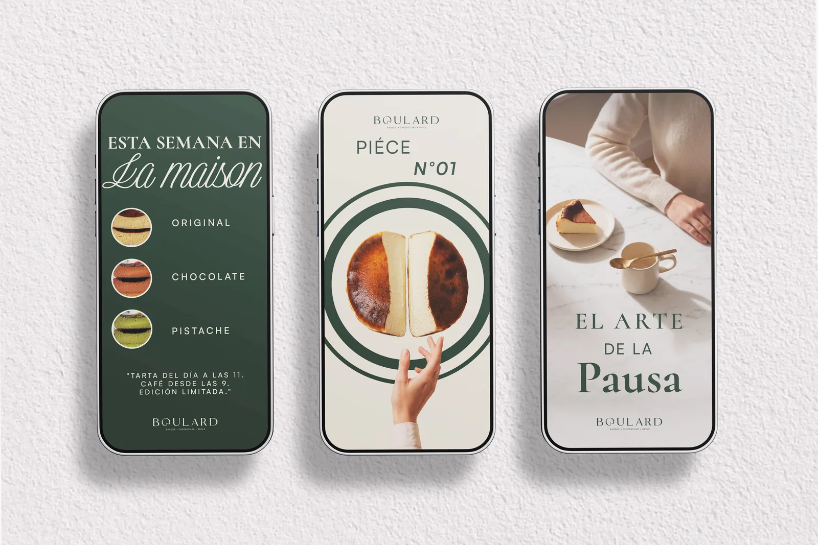
- Campaign & Social Media
Boulard started with a clear ambition: to turn Basque cheesecake into an object of desire.
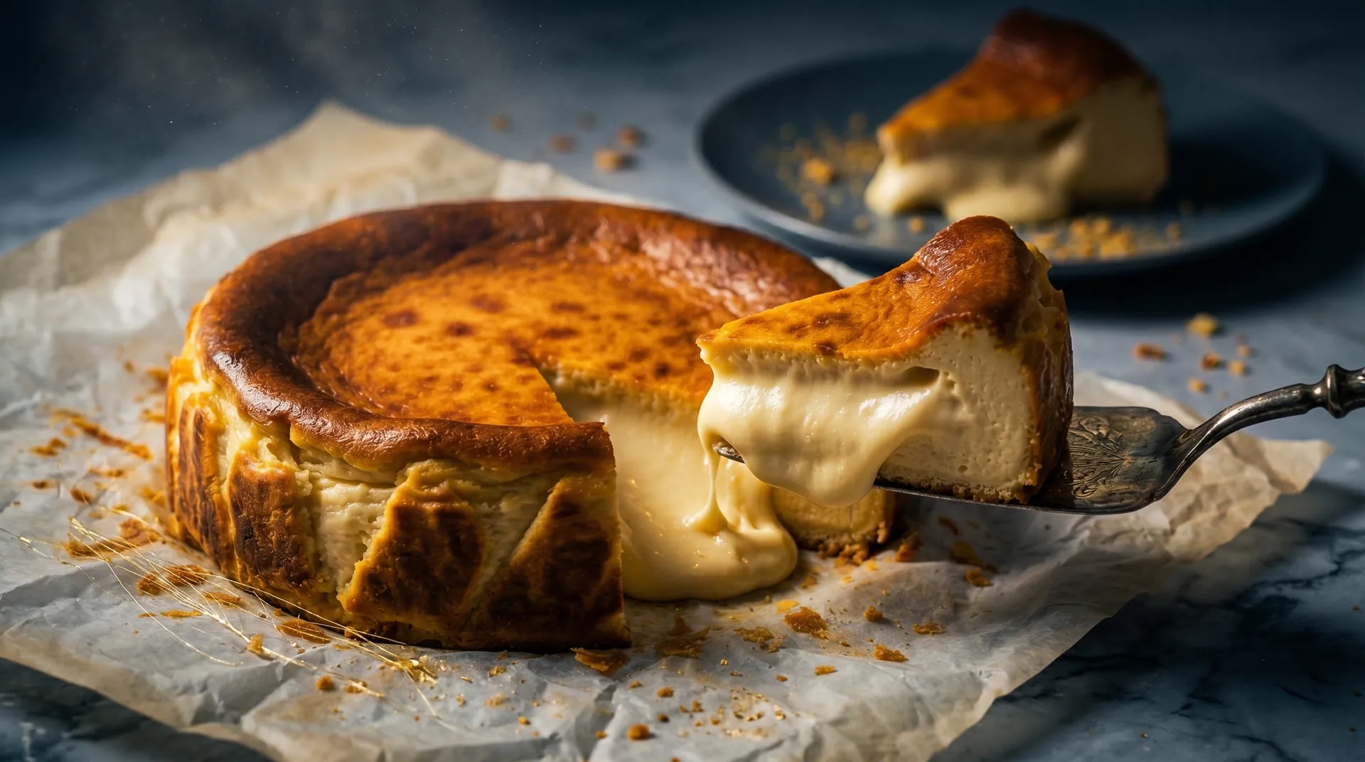
The name, a surname with a French ring to it, announces the maison's promise: European craft, recipes worked with precision and a product served without ornament, with the confidence of something done right. In Cancún, Basque cheesecake was sold as a craving. Boulard wanted to sell it as a ritual. The challenge was to build a brand strong enough to carry that ambition. It had to say quiet luxury without falling into the clichés of artisan baking, and speak three languages at once (French soul, Basque product, Caribbean setting) without letting any one of them drown out the others. The identity had to feel just as solid on a premium box, in the maison's display case or in an Instagram feed. Not a logo: a complete system, ready to run from day one.

We built the identity on the balance between tradition and the contemporary.
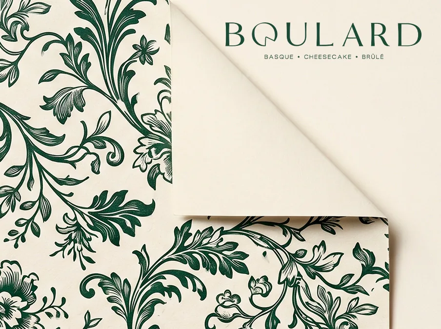
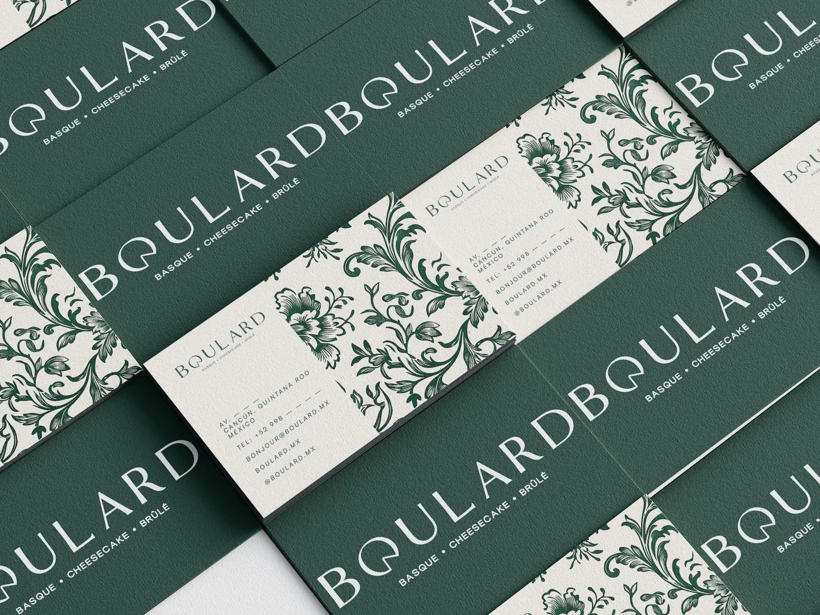
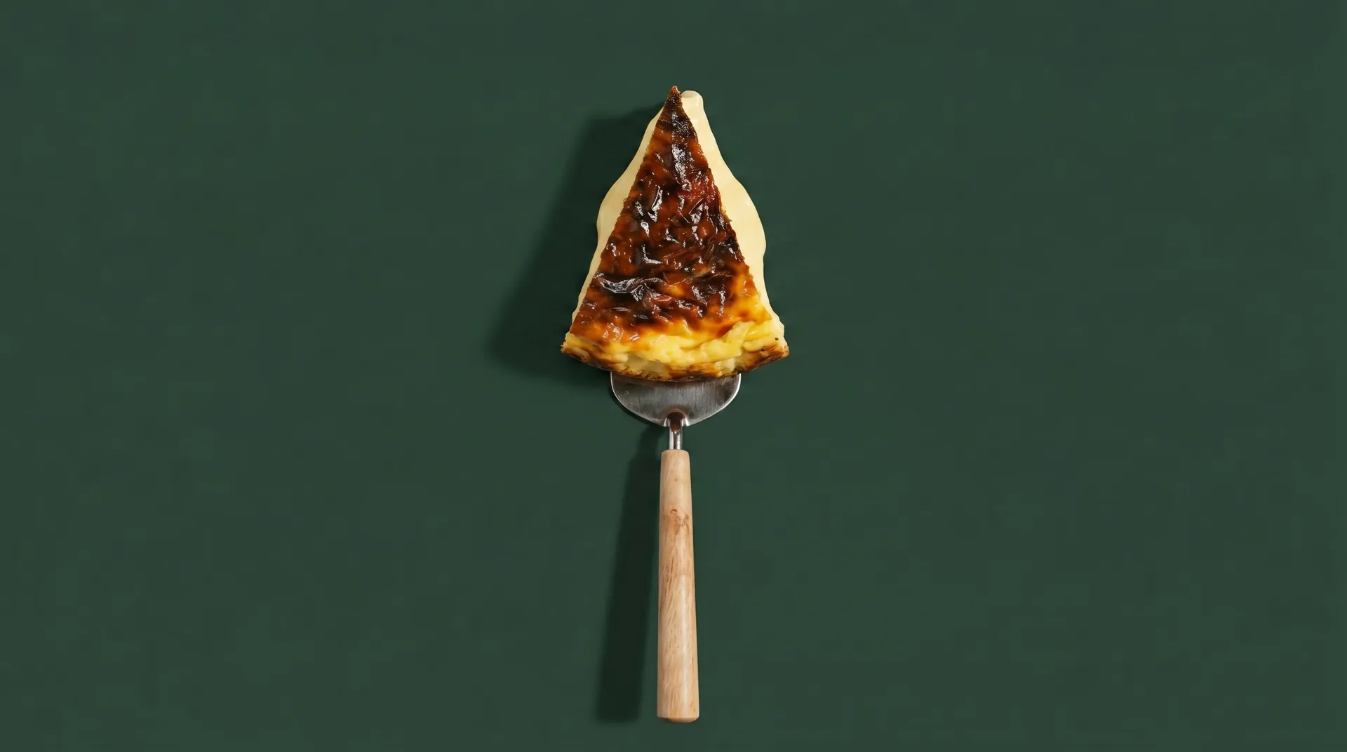
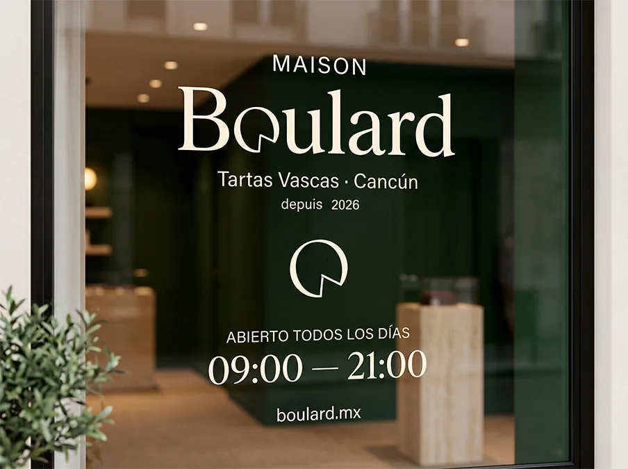
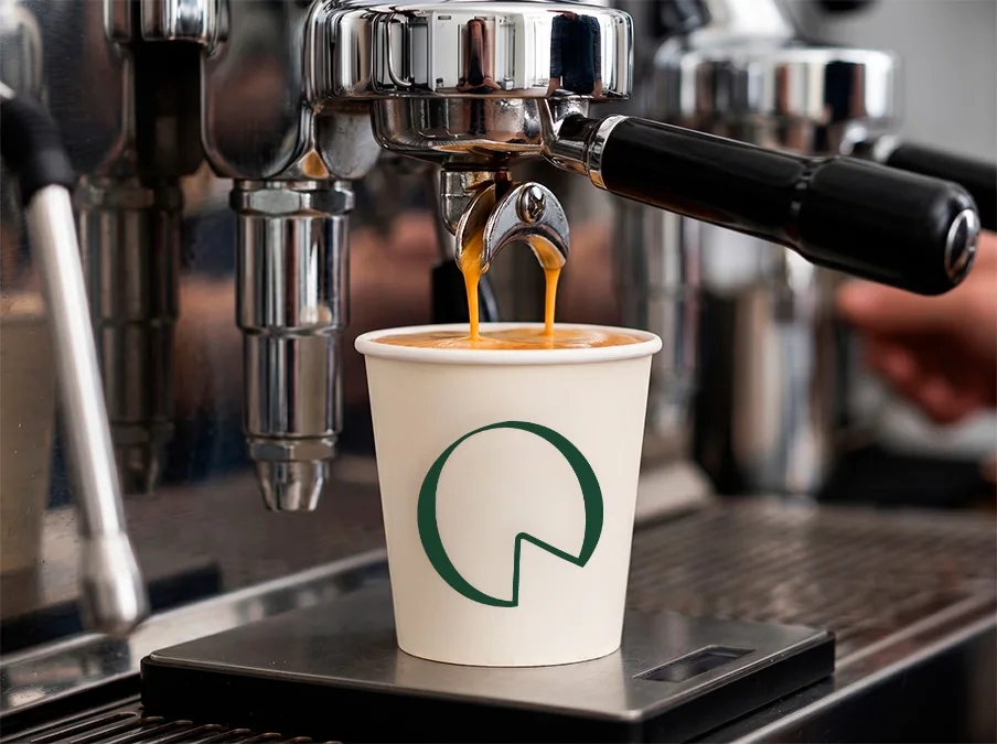
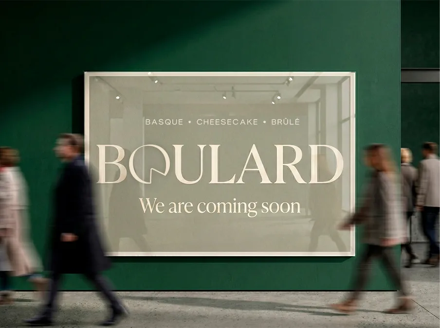
The starting point is the product's most distinctive gesture: the cut. The "O" in the wordmark becomes the cheesecake with a slice removed, a clean-lined symbol that sums up the brand's duality (restrained outside, indulgent inside) and works just as well on a wax seal, embroidered on a cap or as a social media avatar. The palette comes from the product and its setting: charcoal, three deep greens that dress the curtains, packaging and storefront, a paper cream and a brûlé gold taken straight from the bake. The typography brings together three voices (a classic script for accents, an editorial serif for headlines and a geometric sans for everyday communication) that give the brand a register both formal and approachable. The system reaches every surface: premium packaging with gold foil and a red ribbon, wrapping paper with a floral pattern printed in green, double-sided business cards, kitchen and front-of-house uniforms, merchandise and social media templates. Nothing is decoration: every application repeats the same codes until they become unmistakable.
Color Palette
Charcoal #242424
Forest Green #2B3D39
Sage Green #636F64
Seafoam #788E86
Cream #F8F7F2
Brûlé Gold #CBB787
Typography
Dickens Tale Script
Script · accents
Cormorant Garamond
Editorial serif · headlines
Satoshi
Modern sans · body copy
Tone of Voice
Understated, warm and precise. Approachable without being casual, elegant without being cold. The brand speaks three languages (French at heart, Spanish at the table) and always in a low voice.

Pour ceux qui savent.
For those who know.
Basque · Cheesecake · Brûlé
Boulard entered the market with a brand system ready to scale.
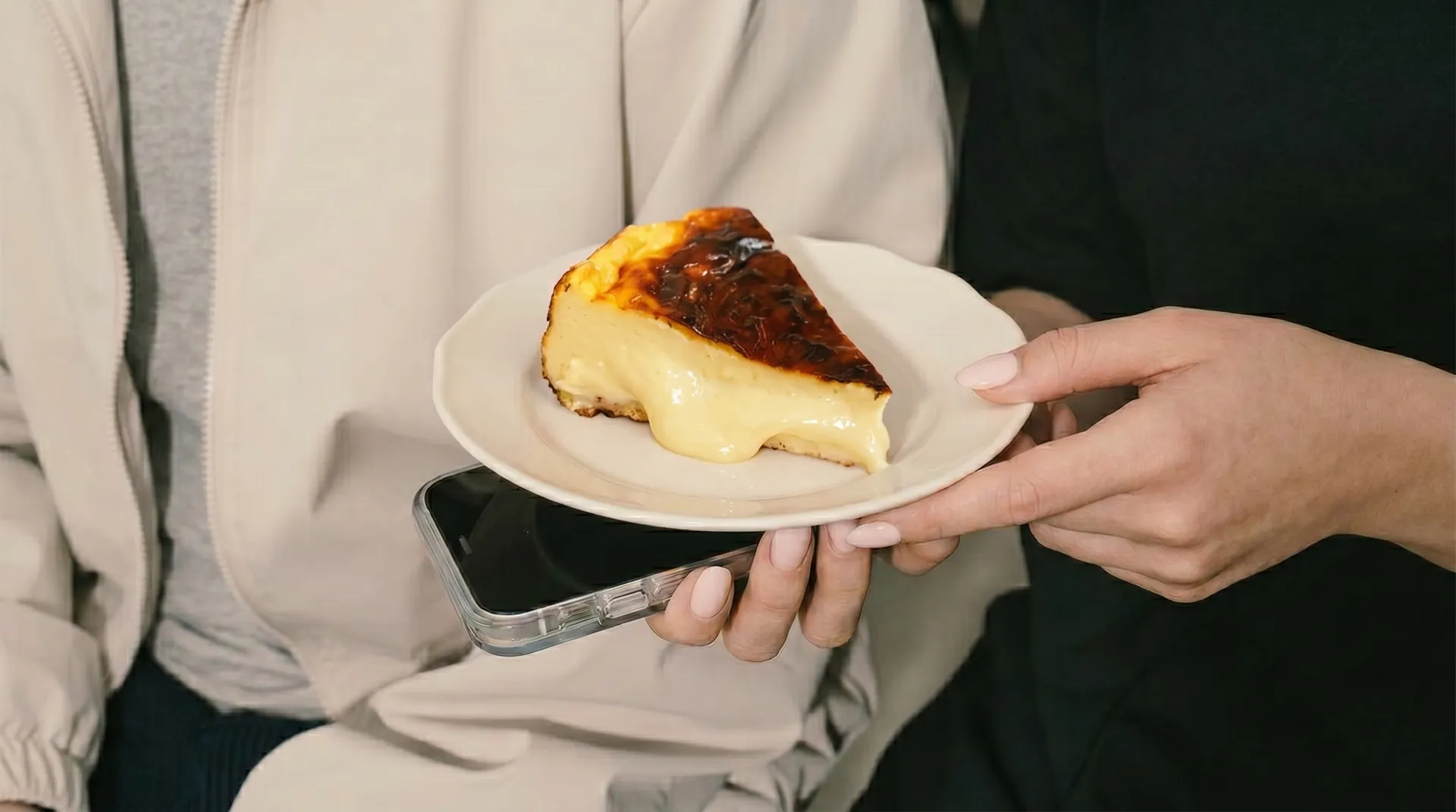
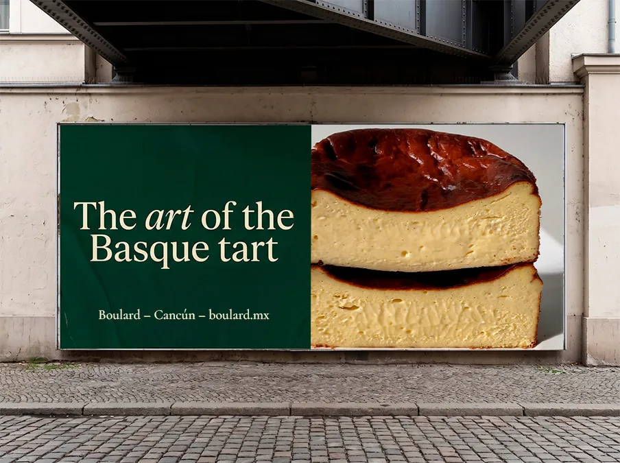
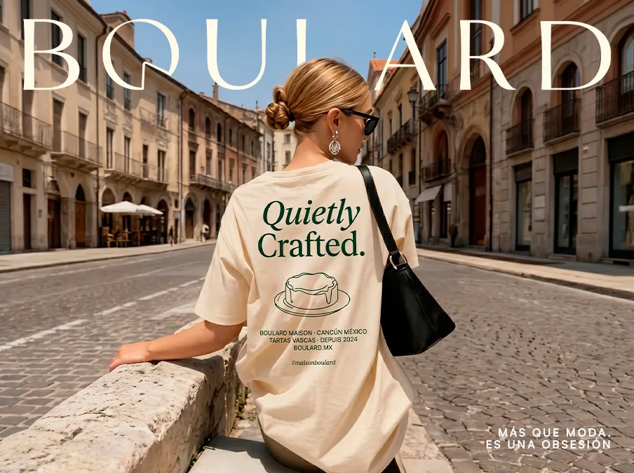
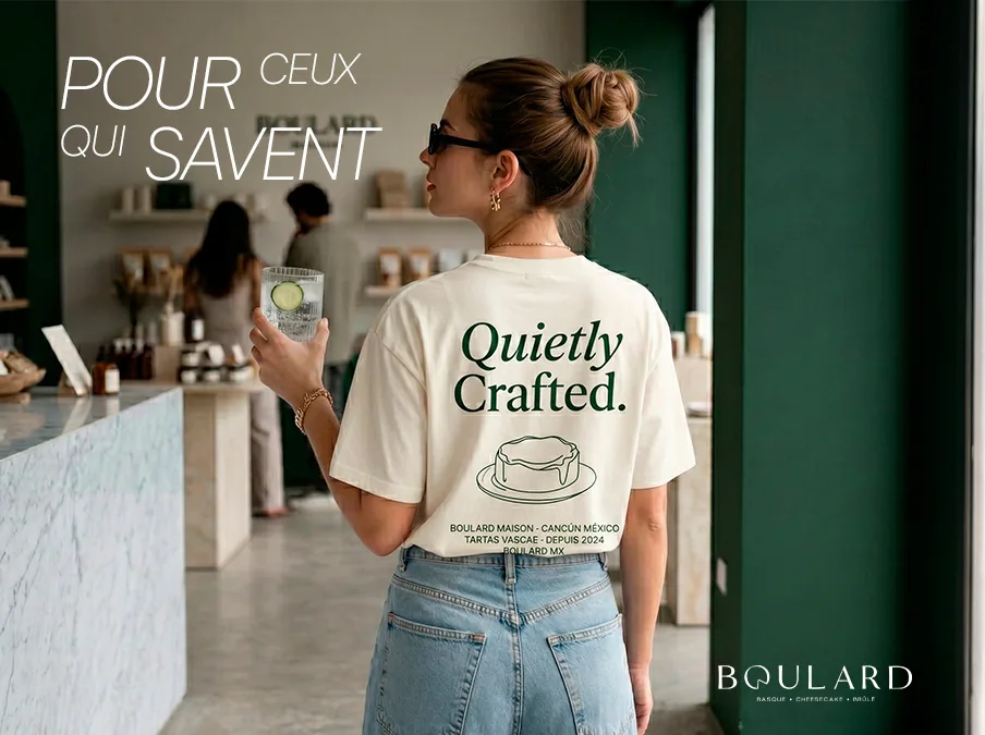
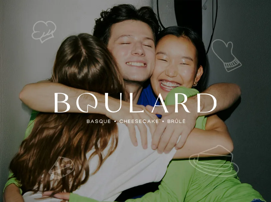
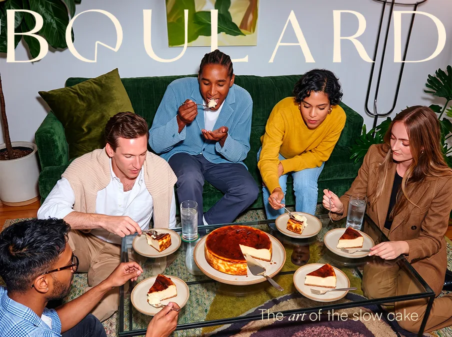
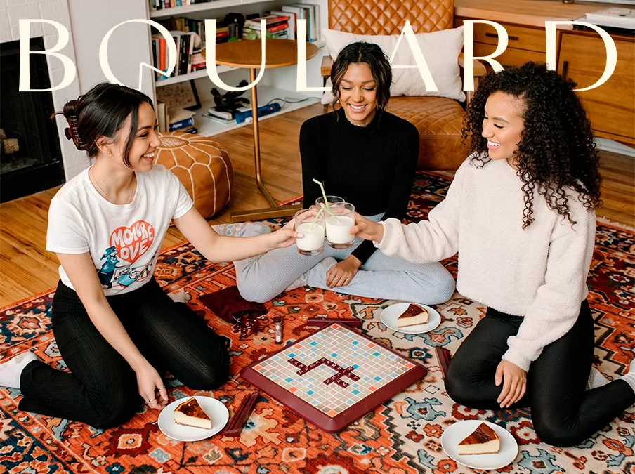
The identity carries through every touchpoint with consistency, from the premium box to the billboard on the street, from the wrapping paper to Instagram stories, and gives the maison the presence of an established brand from day one. The launch campaign, «Pour ceux qui savent», takes the brand into lifestyle territory: a fashion editorial, «Quietly Crafted» merchandise and key visuals that put the cheesecake at the center of social life, not the counter. The promise holds in every piece: this isn't a dessert for everyone. It's a mark of identity for those who know. The result is a brand that doesn't compete for attention (it assumes it) and a branding system that turns a seasonal treat into a house built to become a classic.
Latest Projects.
A curated selection of projects that show our commitment to simplicity and design with purpose.